 When designing a logo, there are a few things that you have to keep in mind:
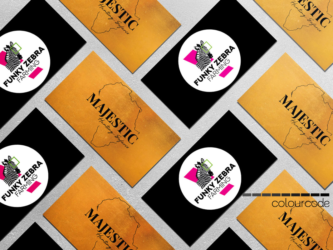
I designed Majestic Hunting Safaris and Funky Zebra Farming with all of these in mind. Even though it may look easy to produce a logo, there is a lot of different factors that should be taken in account. There usually is three of four different designs, before we finalise the logo. But I must say that I enjoy it very much!
0 Comments
What do you do when you have important information to convey, but to put it out as text is just too overwhelming? Infographics (and graphic designers) to the rescue! Using infographics helps to present complex information in an easy, understandable way. And it is even fun to look at. 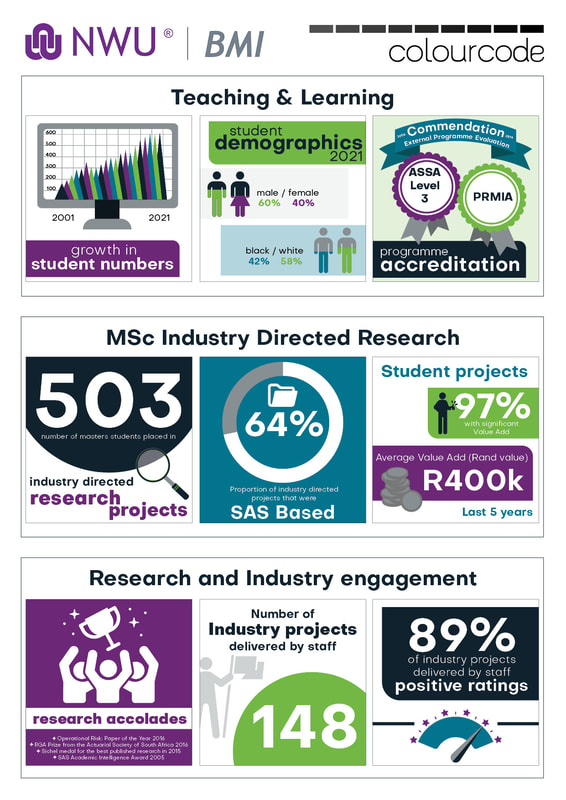 Business Mathematics & Informatics, from the North West University, asked me to design these infographics for them in 2021. These were used in their profile document, that is send out to students and stakeholders.
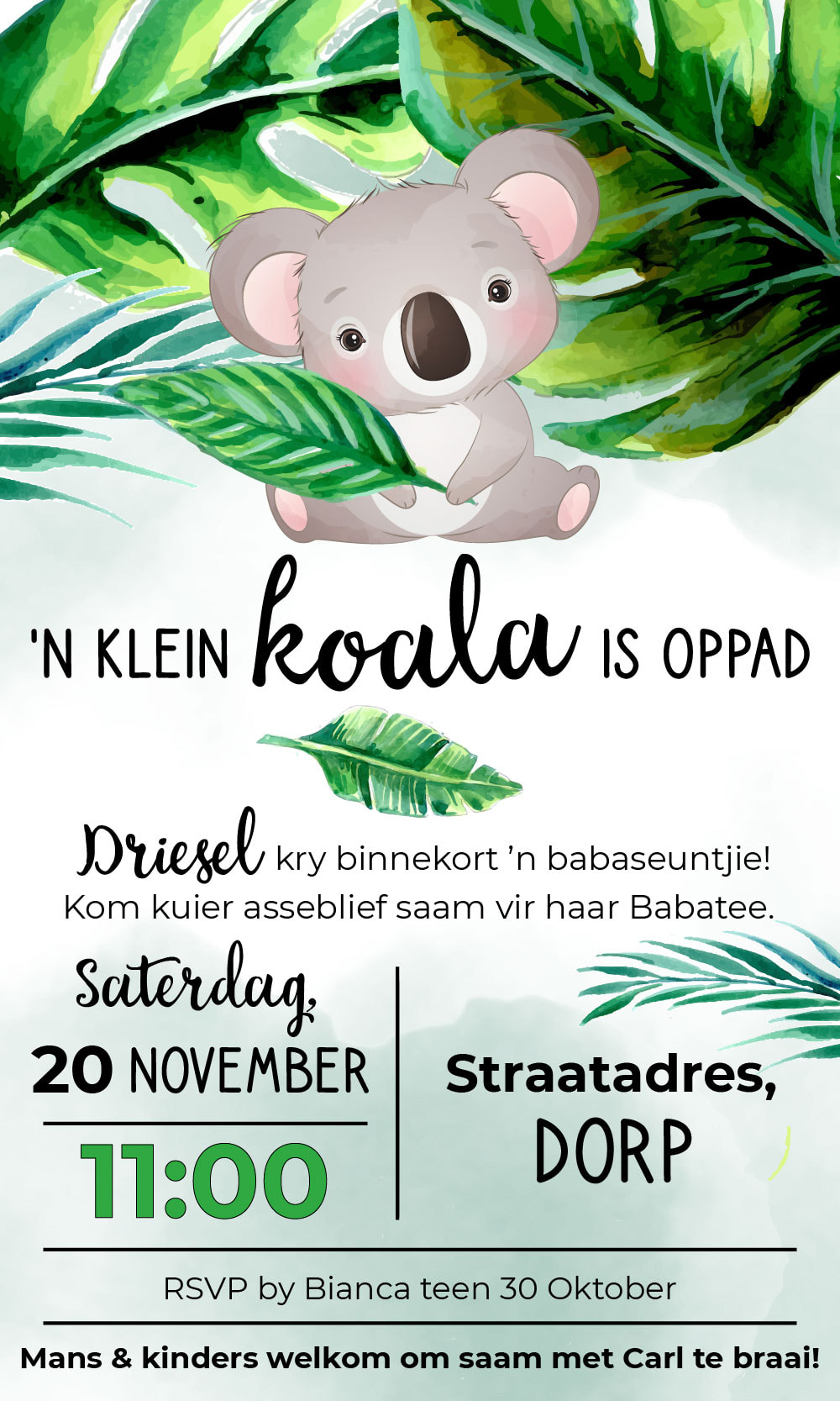
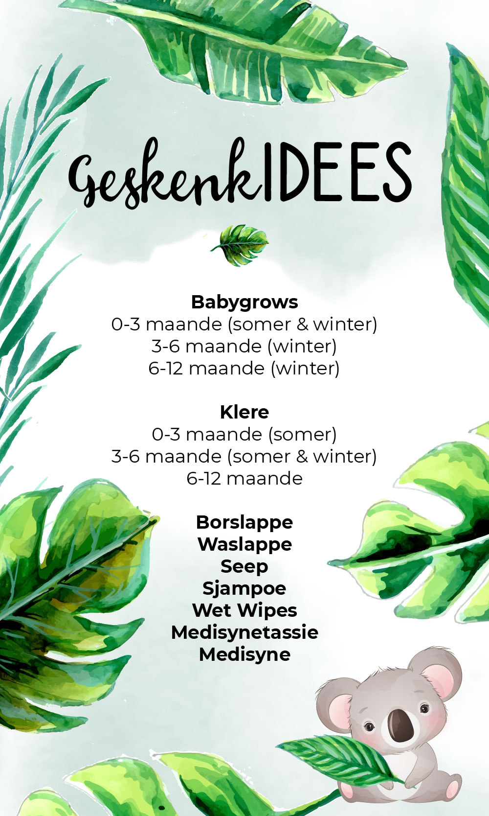
When a baby is on his way, everyone can't help but celebrate! We used a koala theme for these invitations, and also extended it to the gift ideas. I love the watercolour look!
It might be a cliche, but when it comes to resumes or CVs, first impressions count. I few years ago, it was fine to type your CV in Word, and send it like that applying for a job. If you wanted to be fancy, you attached a photo of yourself! These days, you can not afford to have a plain CV anymore. Apparently people just look at your CV for a minute or so. Therefor it is important to showcase your information visually and appealing. Graphic designers to the rescue! 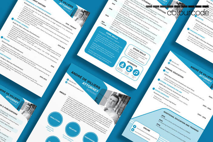 What is important when designing a CV?
Jeanne Prinsloo is a Herbalife Health Coach, and contacted me with a specific idea in mind. She wants to offer her clients something more: forms to track their progress and state their goals. Almost like a diary, but as separate pages that can be printed out as necessary. She wanted something clean and simple. Have a look at the four forms we designed.
I had the pleasure designing my brother-in-law's wedding invitation. They wanted a simple look and feel, and because their flowers will be succulents, I incorporated it into the design. When you look at a simplistic design, you should never think the designer was lazy or hasty. A simplistic design can sometimes take more time an effort than other designs. The specifications for this design for Roast Coffee was the following:
The planning took a while, and for this stage I prefer my pen and notebook. 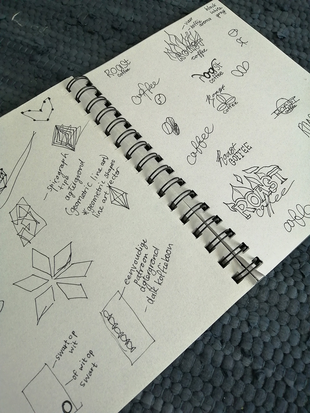 My first ideas were centered around a hand lettered logo, and it developed into one of the logo prototypes. This evolved into a logo with more clean lines and a mathematical (yet decorative) feel to it. And then I decided to strip the logo of all decorative elements, and this was the one the client chose. I used the final logo design with a few different background patterns for different packaging design prototypes, and the client chose this one, as displayed below. As always... "Less is more". 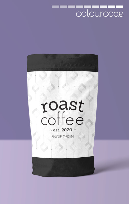 I've designed the front cover for Questus's Tax Guide since 2015. This year, we decided to be bold in the design, and I'm extremely excited about the end result! The maroon corporate colour symbolises life and action. The design is modern, and the mathematical precision in the design is also significant. This free tax guide will be available soon from Questus in Potchefstroom. Also have a look at their webpage for all the services they offer. 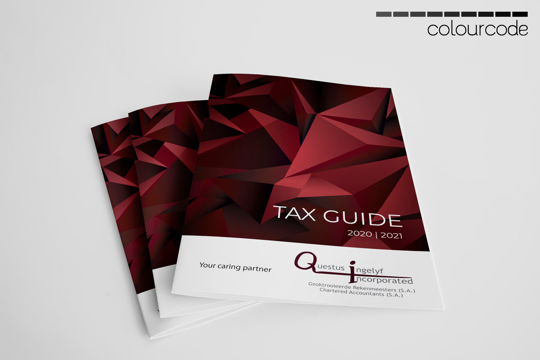 Fearfully Wonderfully Made is a ministry for prenatal discipleship. Different services like Life Coaching, Breastfeeding support, encouragement and prayer groups are just some of the services they offer. Have a look at their webpage to learn more. I have designed their webpage, all of their marketing material and corporate identity, but would like to share their newest flyer design. These were also converted to poster designs to be placed at specific places in Potchefstroom. The flyers will be printed on both sides (with the designs below). The different formats (landscape vs portrait) force interaction from the reader, because it has to be turned and rotated to read. You may think this is a silly thing to do, but it helps to keep the reader's attention. This is quite useful in printed marketing, because a reader gets overwhelmed with all the print media. This is just my opinion though, and I'm open to other suggestions! :) 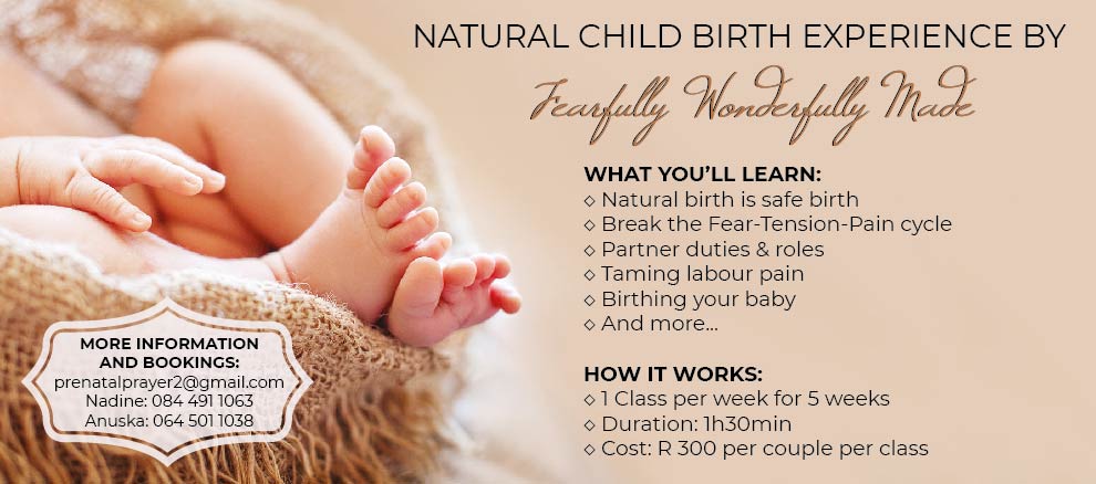 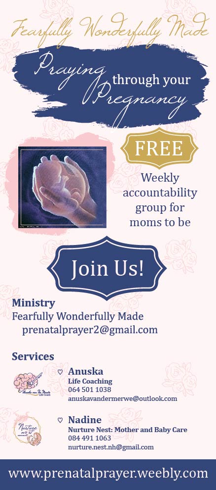 Huis Eikelaan is a retirement home in Potchefstroom. When it's the birthday of one of the residents, they give out a card with birthday wishes. I have designed this for a few years, and here is the new version. 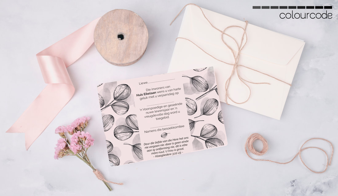 |
|
Copyright © 2023
No reproduction without written permission from Colourcode Designs. |